Table of Contents
- When Opposites Become the Most Interesting Part of Fashion
- 1. Contrast Styling Is About Fabric Personality, Not Just Appearance
- 2. Lace Is One of Fashion's Most Effective Contrast Materials
- Color Clash: When Opposing Colors Are Connected Through Texture
- 3. The Five Principles of Sophisticated Color Clash
- 4. Four High-Value Contrast Pairings for Designers
- 5. Contrast Must Work in Production, Not Only on a Moodboard
- 6. Why Contrast Is Commercially Valuable for Fashion Brands
- 7. United Lace: Turning Textile Contrast into Design Possibility
- Conclusion: Contemporary Style Lives in the Space Between Opposites
- FAQs
When Opposites Become the Most Interesting Part of Fashion
Some of the most memorable fashion looks are not created through perfect harmony.
They are created through controlled disagreement.
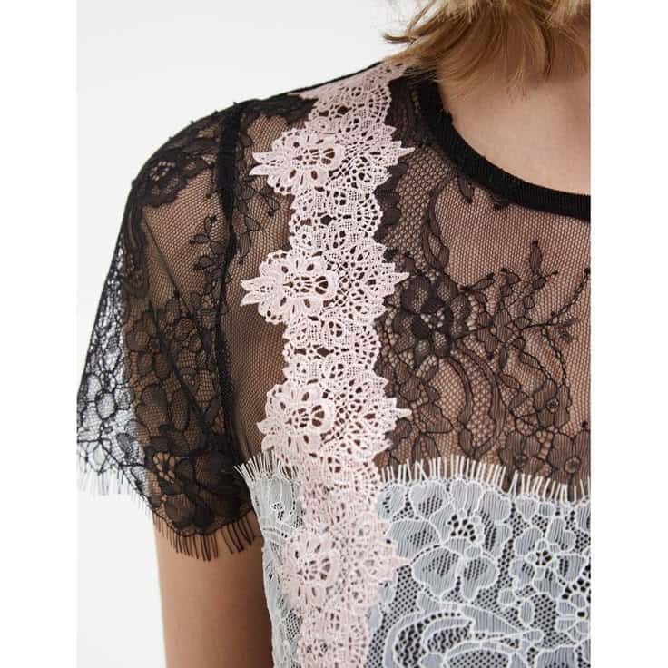
A delicate lace blouse beneath an oversized tailored jacket. A structured Guipure skirt against a fluid silk shirt. Black floral embroidery over an unexpected acidic green lining. Powder pink Chantilly lace worn with charcoal tailoring. A romantic embroidered textile interrupted by a utilitarian silhouette.
These combinations work because contemporary fashion increasingly treats contrast not as a styling accident, but as a design language.
Contrast Styling asks a more sophisticated question than simply, “Do these fabrics match?”
It asks:
What happens when two materials with completely different personalities are deliberately placed together?
Color Clash extends the same principle into color. Rather than coordinating every shade conventionally, designers introduce opposing or unexpected hues—and then use texture, transparency, motif and surface dimension to make the relationship sophisticated rather than chaotic.
For fashion designers and garment manufacturers, this distinction matters. Contrast is not simply a visual trend. It influences fabric selection, silhouette development, product differentiation, photography, merchandising and ultimately how premium a garment feels.
For United Lace, whose expertise centers on lace and embroidery fabrics, this approach is especially relevant. Lace is naturally suited to contrast because it is rarely perceived as color alone. Its openwork construction, motif density, transparency, relief and interaction with the fabric beneath it give designers multiple layers of visual information to work with.
The result is a powerful principle for contemporary fashion:
When colors disagree, texture can become the mediator.
1. Contrast Styling Is About Fabric Personality, Not Just Appearance
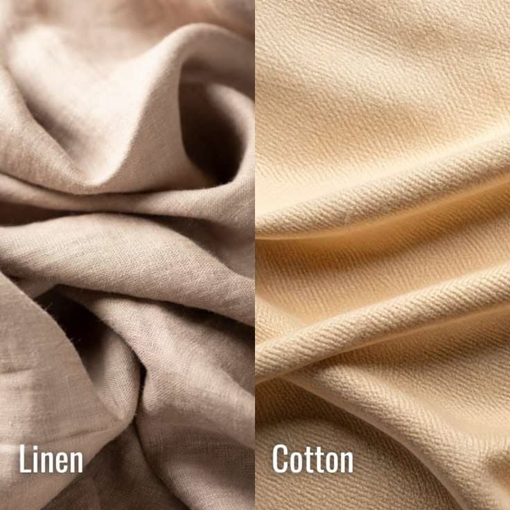
Every textile has a visual personality.
Satin appears fluid, reflective and polished. Denim communicates durability and utility. Crisp cotton poplin feels controlled and architectural. Organza is translucent yet structured. Velvet absorbs light and creates visual depth.
Lace is even more complex because different lace constructions communicate entirely different personalities.
Chantilly lace tends to feel delicate, airy and fluid because of its fine ground and intricate motifs.
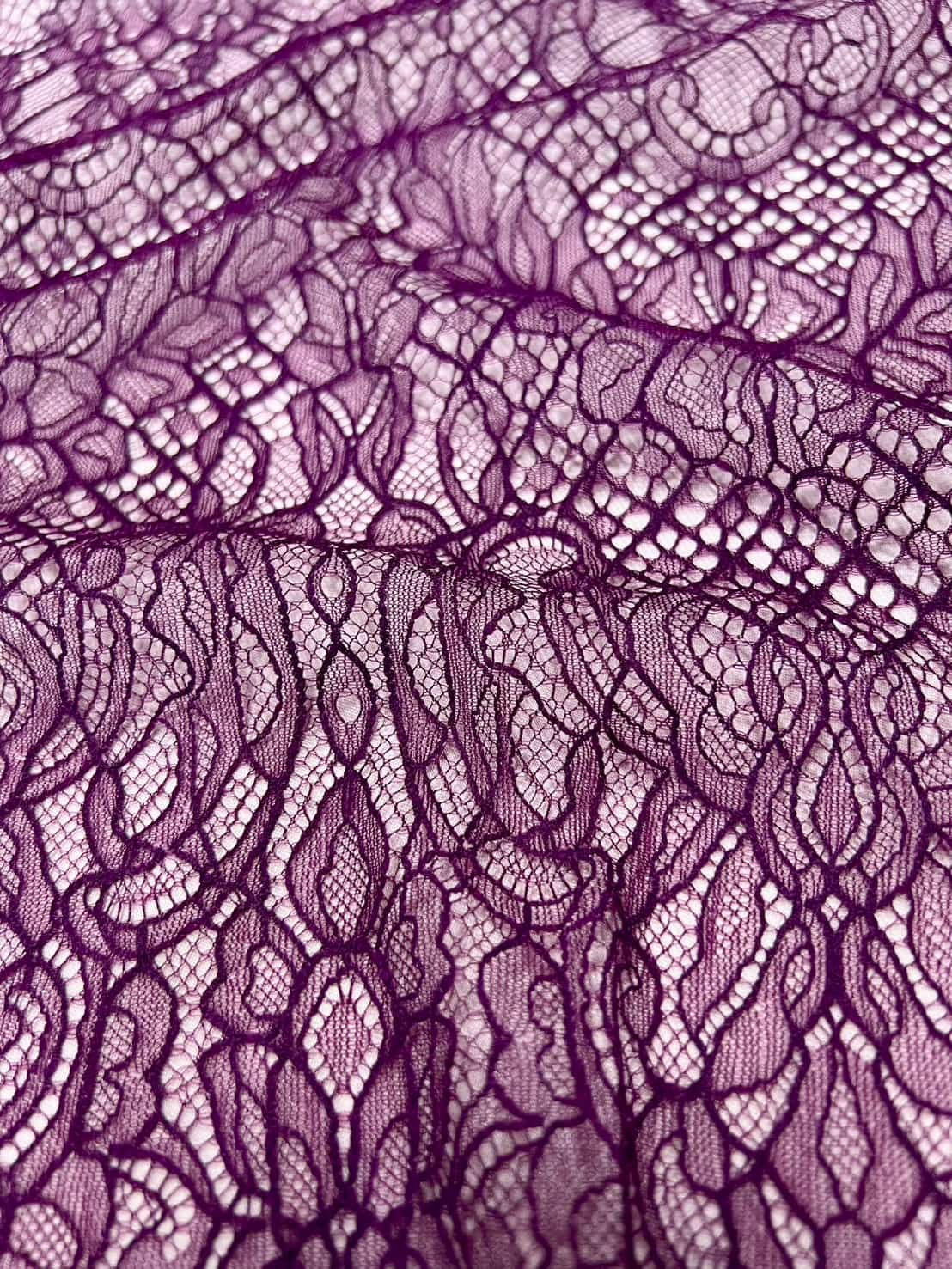
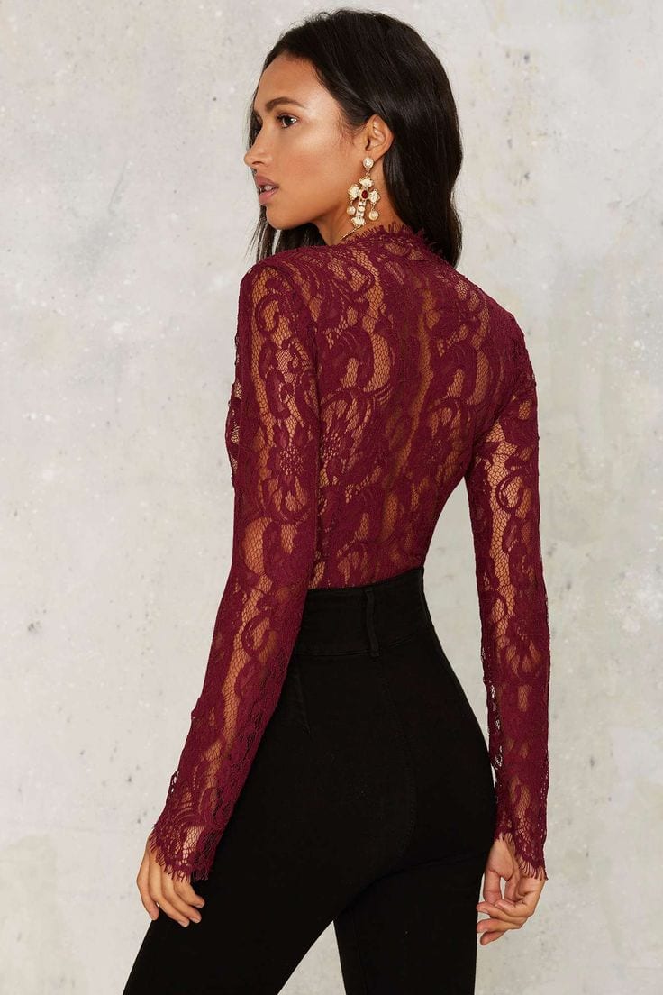
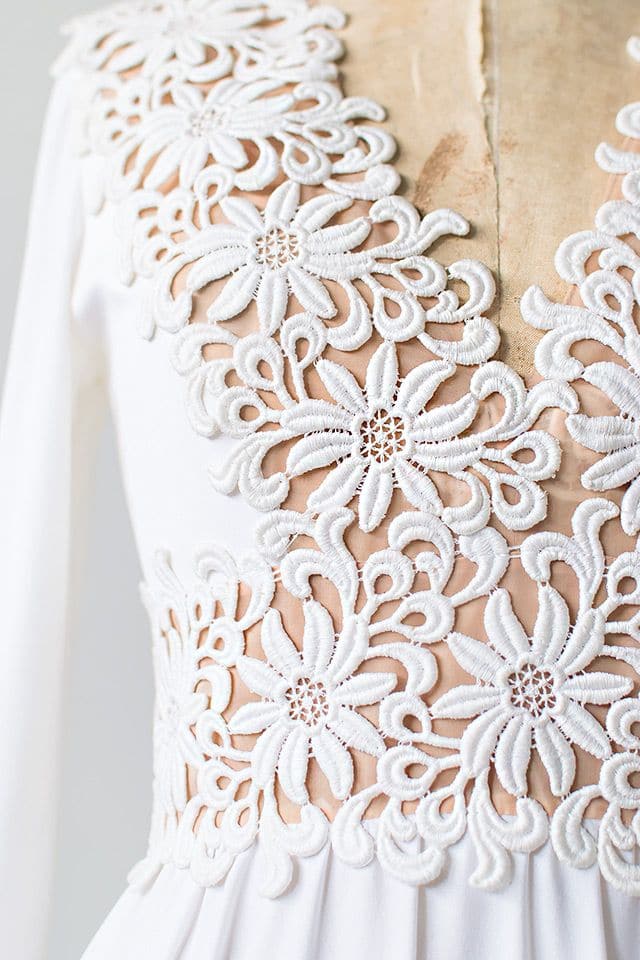
Guipure lace is substantially more architectural. Raised motifs and the absence of a conventional net ground give it stronger visual mass and structural presence.
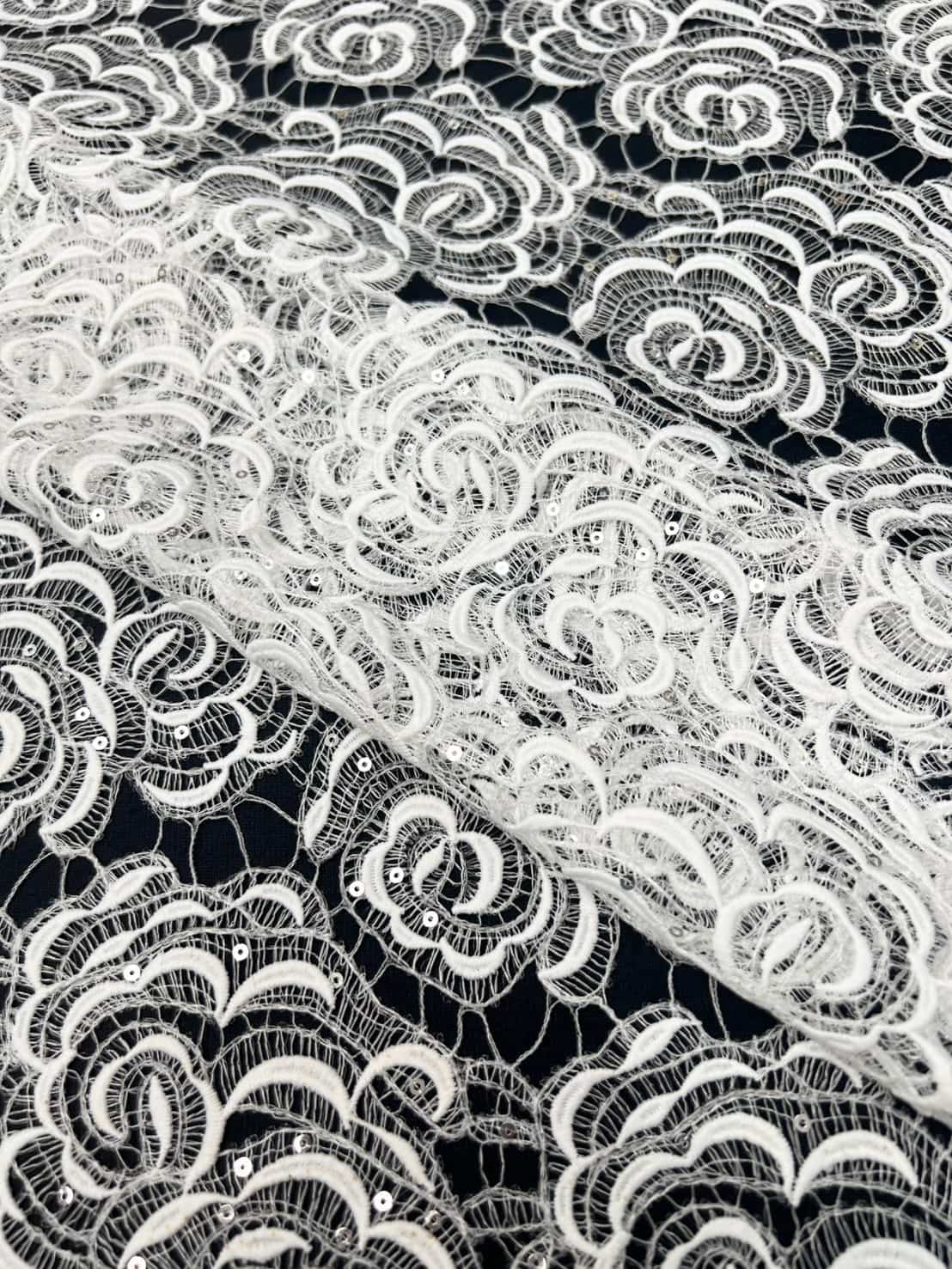
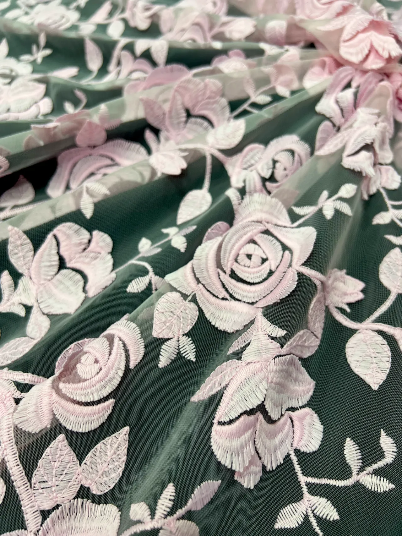
Tulle and embroidered tulle introduce transparency and lightness, allowing the layer underneath to participate in the design.
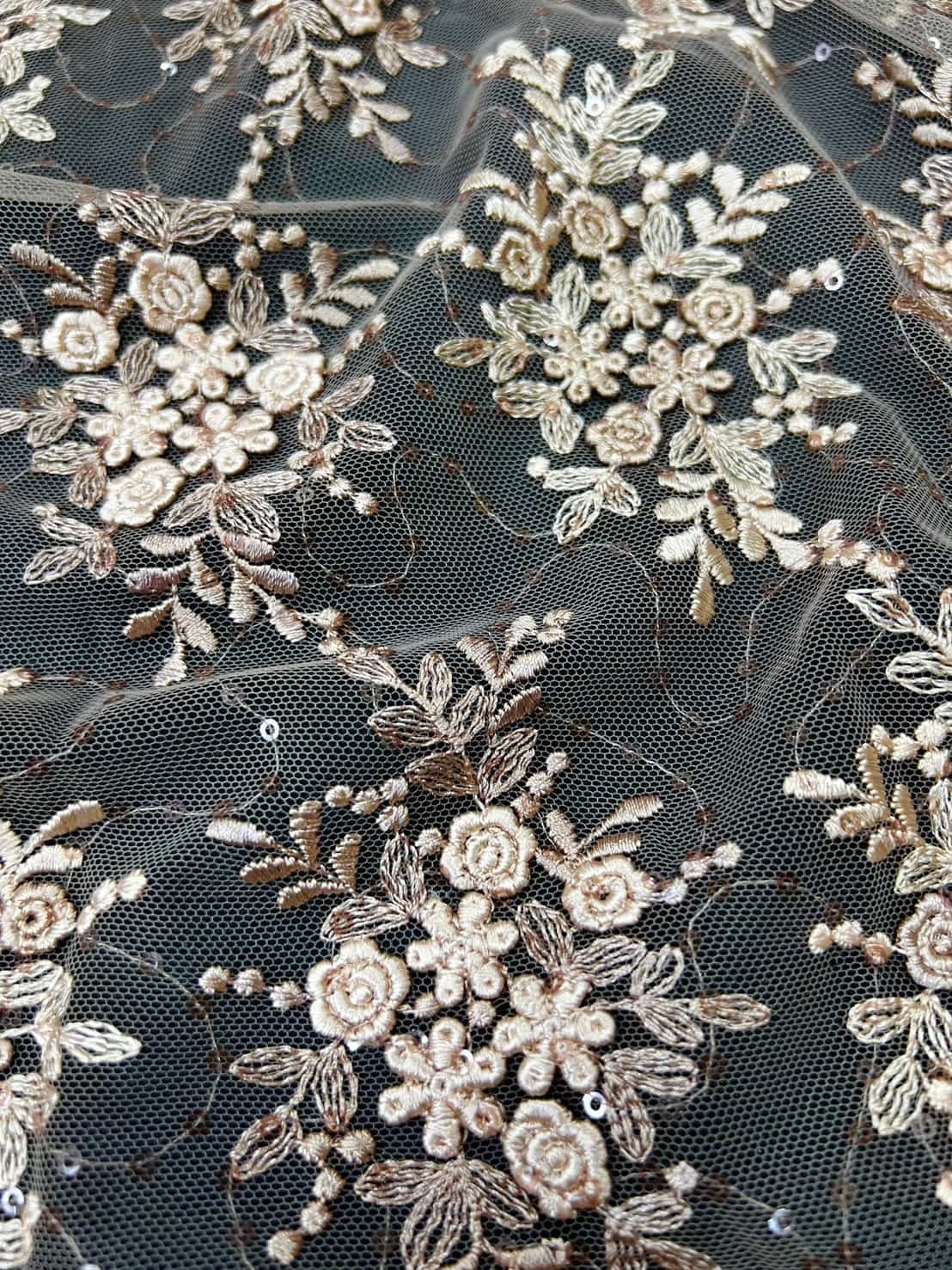
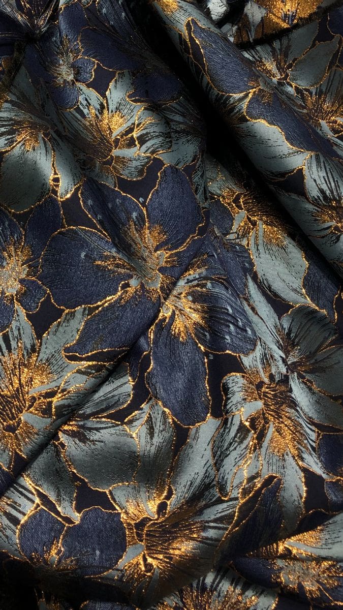
Metallic and embellished lace interact dramatically with light.
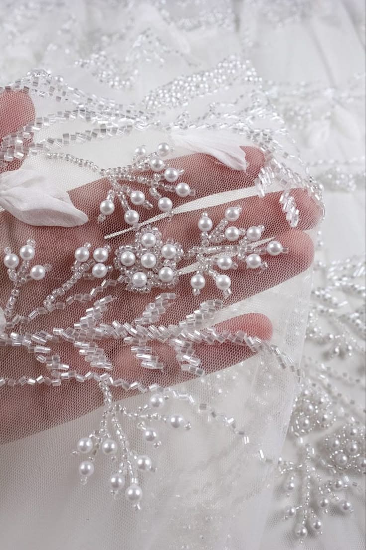
Cotton lace and eyelet create a more tactile, matte and natural expression.
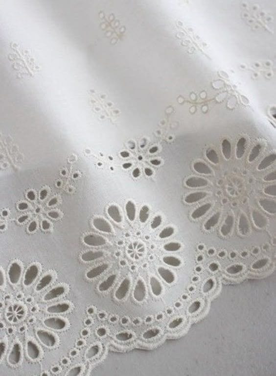
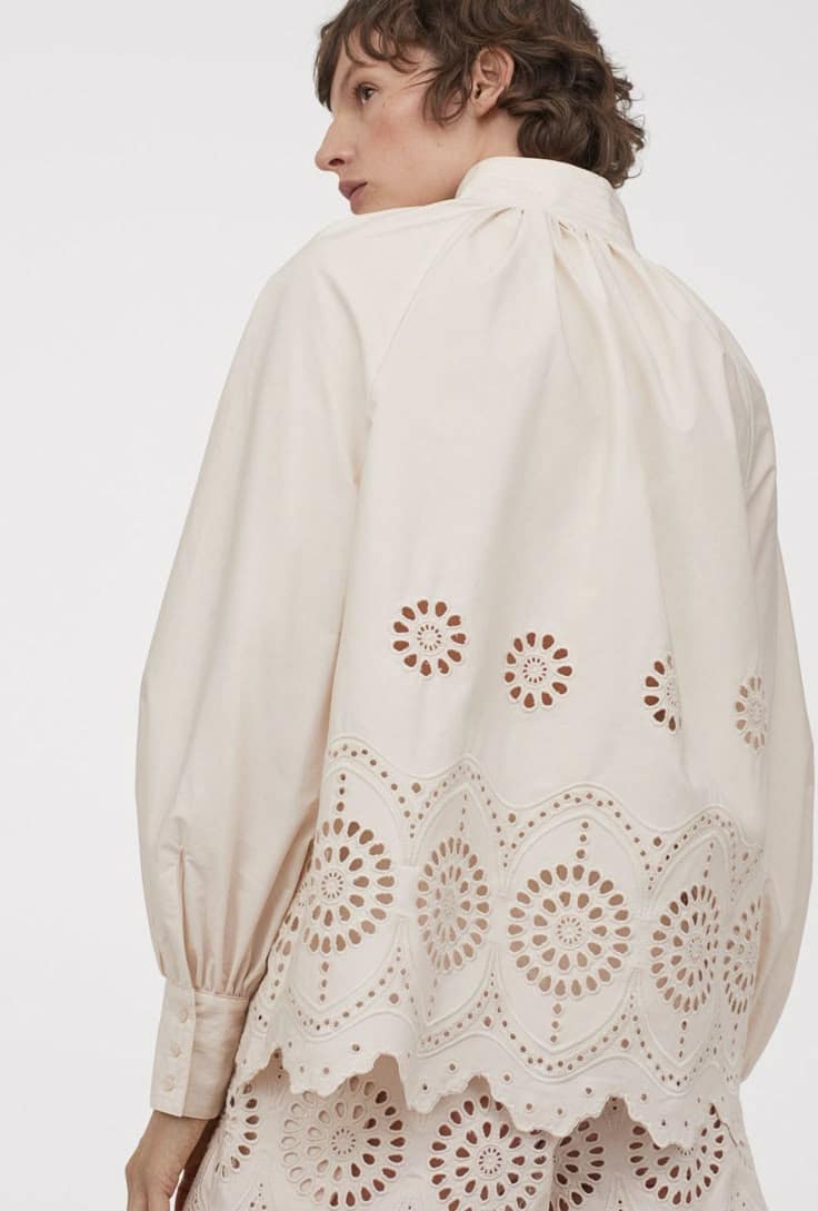
United Lace's wider lace and embroidery fabric collection gives designers access to precisely these different textile personalities.
The objective of contrast styling is therefore not to find two fabrics that behave similarly. Often, the more interesting solution is to find materials that behave differently but share one connecting element.
That connection might be color, motif scale, silhouette, repetition, proportion or finish.
Soft + Structured
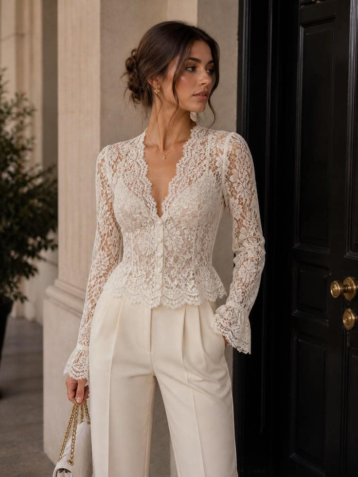
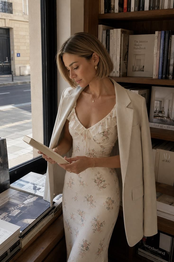
One of the strongest contemporary combinations is softness against structure.
Consider delicate black Chantilly lace under a sharply tailored ivory blazer.
The lace contributes transparency, movement and intricate surface detail. The jacket contributes clean lines and authority.
Neither fabric needs to compete.
The contrast itself becomes the aesthetic.
For designers exploring this shift toward material-led fashion, United Lace's article on Fabric & Lace Trends 2026 examines how texture, drape, transparency and structural integrity are becoming increasingly important to contemporary brand identity.
Matte + Shine
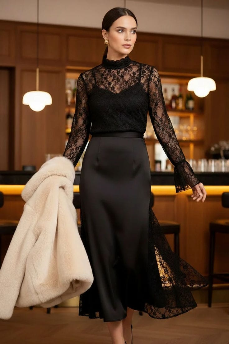
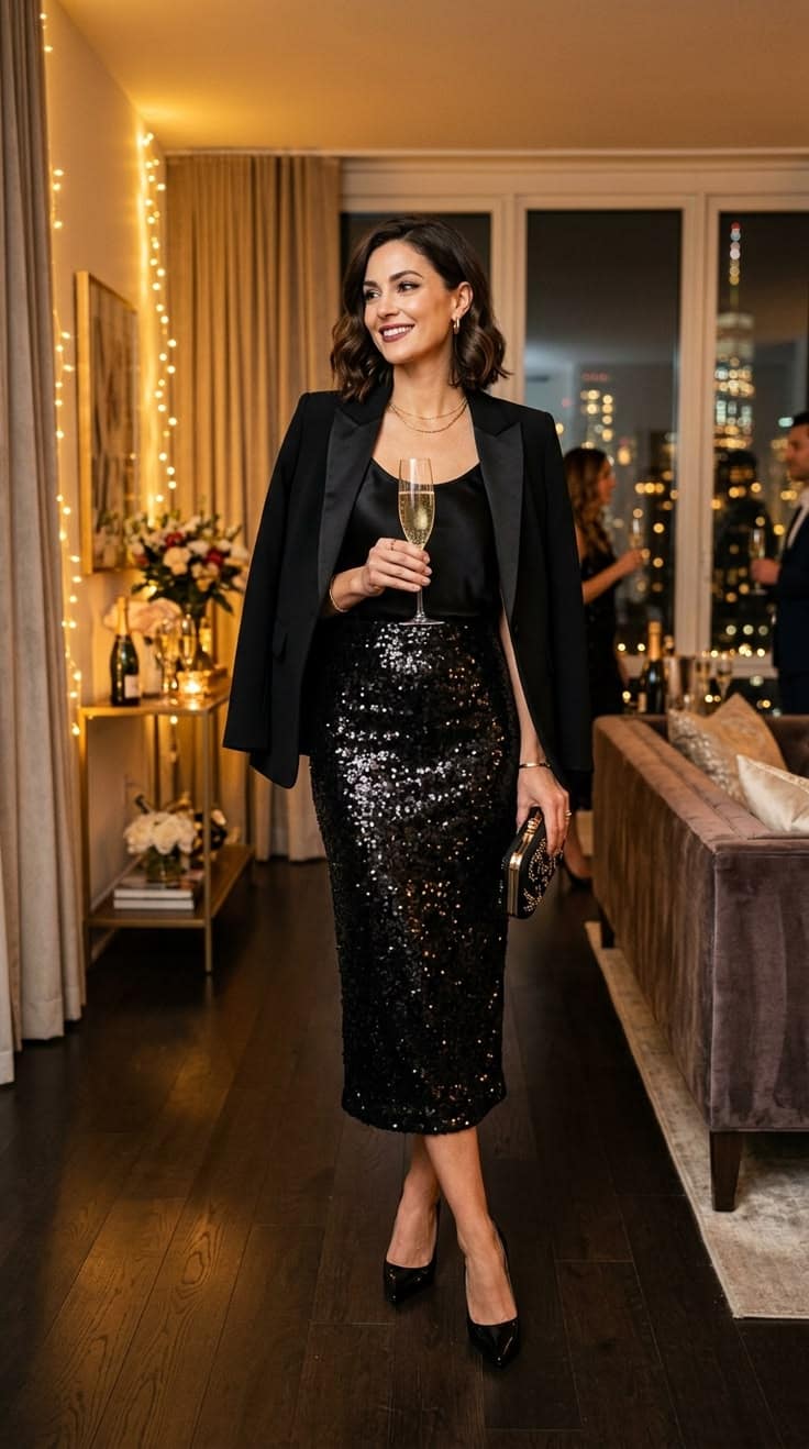
A second effective contrast comes from light reflection.
Matte Guipure against satin creates a sophisticated tension because one surface absorbs light while the other reflects it.
Metallic embroidery over matte crepe works for the opposite reason: the embroidery becomes an illuminated focal point against a visually quiet base.
This technique is especially valuable in eveningwear because a designer can create drama without relying on excessive embellishment.
Transparent + Opaque
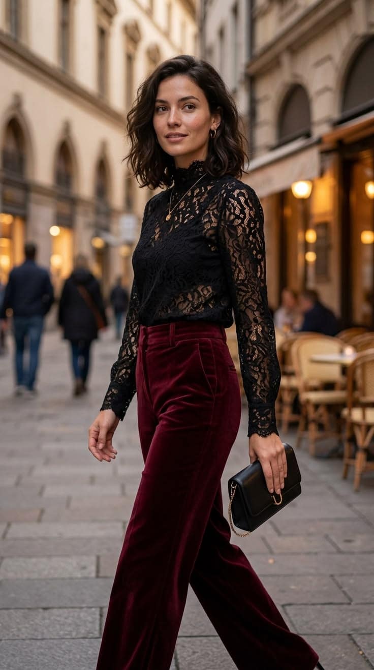
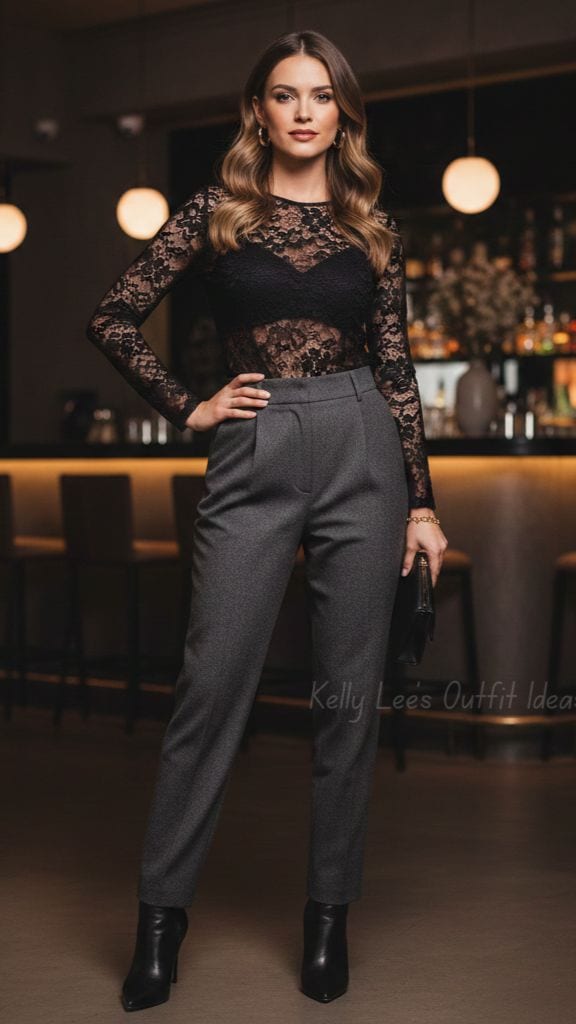
Transparency provides another form of controlled opposition.
A sheer Chantilly lace panel beside opaque wool suiting can transform a conventional jacket or dress into something much more contemporary.
Similarly, embroidered tulle over an opaque lining changes according to the lining color, meaning one lace can generate multiple visual identities.
The possibilities of transparency are explored further in United Lace's guide to sheer lace and dimensional layering.
2. Lace Is One of Fashion's Most Effective Contrast Materials
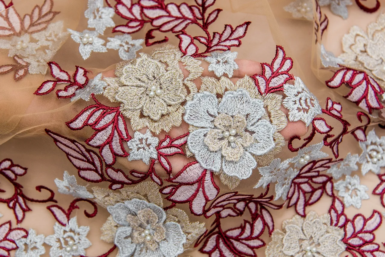
Lace has traditionally been associated with romance, femininity, bridalwear and eveningwear. Contemporary designers, however, increasingly use lace precisely because it can disrupt those expectations.
Put romantic lace beside tailoring and it becomes sharper.
Put Guipure beside denim and it becomes younger.
Place embroidered tulle over sportswear-inspired construction and it becomes experimental.
Combine Chantilly with leather and its delicacy becomes more visible because the opposing surface emphasizes it.
This illustrates an important principle:
Contrast amplifies textile identity.
A soft fabric looks softer beside something rigid. A transparent textile looks more transparent beside an opaque one. A raised embroidered motif becomes more dimensional beside a flat surface.
This evolution also explains why lace has moved beyond purely decorative applications. United Lace's analysis of Lace Fabric Trends in 2026 highlights hybrid Guipure and sheer constructions, dimensional embroidery, geometric lace and metallic effects as important directions for modern brands.
For designers, this opens a much broader design vocabulary.
Color Clash: When Opposing Colors Are Connected Through Texture
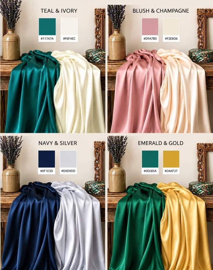
Color clash is often misunderstood.
It does not mean combining random bright colors.
Sophisticated color clash involves deliberately positioning hues that create visual tension while controlling that tension through textile selection, proportion and surface treatment.
A flat orange fabric against flat cobalt blue can feel graphic and aggressive.
But imagine burnt orange satin beneath midnight-blue embroidered tulle.
Suddenly, the relationship becomes more complex.
The blue embroidery partially obscures the orange. The transparent ground allows the warm color to emerge between motifs. Light changes the relative dominance of each shade as the garment moves.
The clash has acquired depth.
This is why designers should never evaluate color independently from material.
As explored in United Lace's Color Trends 2026, contemporary color direction increasingly combines emotional, natural and technologically influenced palettes. The commercial opportunity lies not only in selecting fashionable shades, but in determining how those shades behave through fabric.
3. The Five Principles of Sophisticated Color Clash
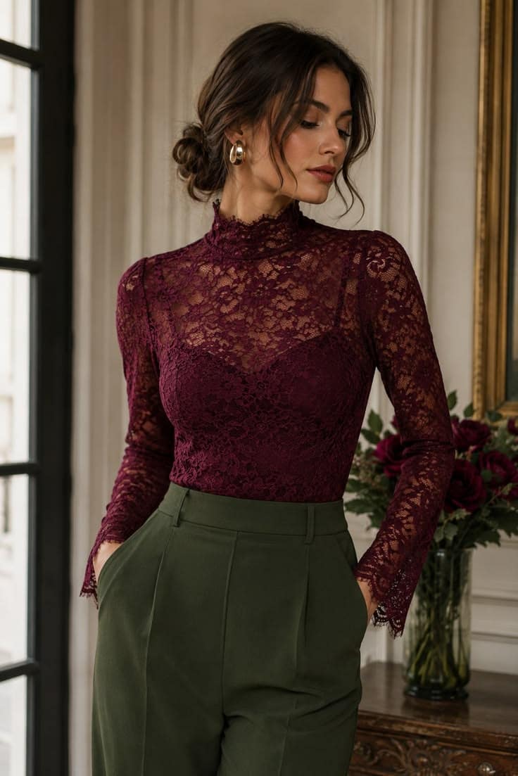
Principle 1: Let One Color Dominate
The simplest way to prevent a color clash from becoming chaotic is to establish hierarchy.
Think approximately:
70% dominant color + 20% contrasting color + 10% accent
The ratio does not need to be mathematical, but the visual hierarchy should be obvious.
A navy Guipure dress might reveal coral through selected openings. A cream tailored suit might incorporate an emerald lace blouse. A black gown might use electric blue embroidered tulle only across sleeves and upper bodice.
Contrast becomes more luxurious when the eye understands where to look.
Principle 2: Use Transparency as a Color Filter
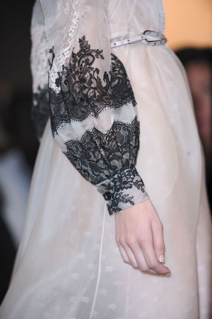
Sheer lace is exceptionally useful for sophisticated color clash.
Place black Chantilly over red and the red becomes darker, moodier and more complex.
Place ivory embroidered tulle over cobalt and the blue appears through negative space while the embroidery softens its intensity.
Place dusty pink lace over burgundy and two related but visibly distinct tonal levels appear simultaneously.
For fashion designers, this means lining should not always be treated as an invisible technical component.
The lining can become part of the color architecture.
Principle 3: Separate Strong Colors with Texture
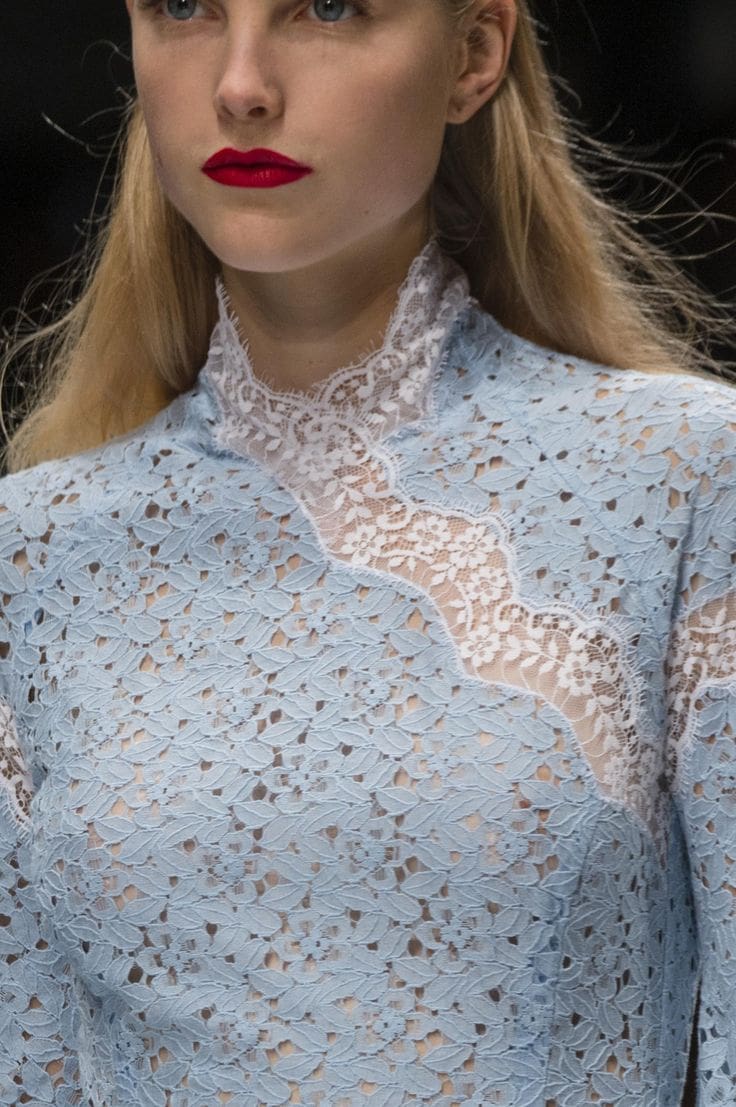
Two highly saturated colors can compete when both occupy large, flat surfaces.
Texture interrupts that competition.
Imagine fuchsia beside orange. In plain fabrics the combination may appear extremely graphic. Replace the fuchsia with dimensional floral embroidery or open Guipure and the visual effect changes because part of the color becomes negative space.
The eye now reads:
color + motif + depth + base fabric
rather than simply:
color against color.
This is one reason lace and embroidery are particularly effective tools for advanced color styling.
Principle 4: Contrast Temperature, Not Only Hue
Color clash can also come from combining warm and cool tones.
Examples include:
- rust + icy blue;
- chocolate + lavender;
- coral + teal;
- mustard + violet;
- warm champagne + steel grey.
Texture can determine which side dominates.
A matte chocolate Guipure beside glossy lavender satin creates a completely different emotional effect from glossy chocolate satin paired with matte lavender cotton.
For designers working in culturally sensitive or occasion-driven markets, United Lace's analysis of lace color tones and their meaning also demonstrates why color should be considered as part of product identity rather than decoration alone.
Principle 5: Use Motif Scale to Control Color Intensity
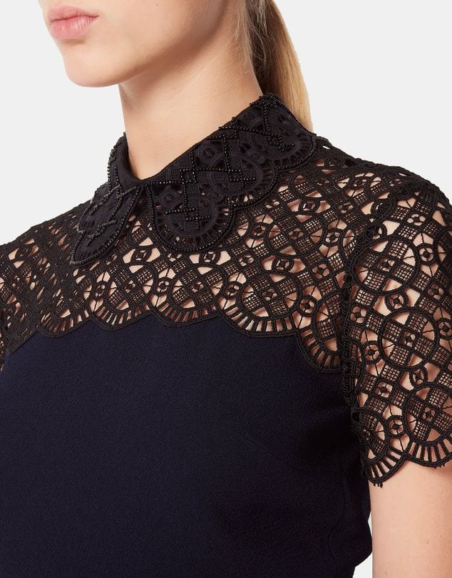
Large motifs create larger blocks of color.
Micro-florals disperse color more delicately.
This makes motif scale an important tool in color management.
If a designer wants strong contrast without overwhelming the garment, a fine Chantilly pattern can introduce the secondary color almost like visual noise or shadow.
If the objective is bold runway impact, oversized Guipure or large embroidered botanical motifs can make the contrasting shade much more dominant.
4. Four High-Value Contrast Pairings for Designers
Chantilly Lace + Tailoring
Character: delicate versus authoritative.
Try black Chantilly with camel tailoring, ivory Chantilly with charcoal, or powder blue lace with chocolate brown.
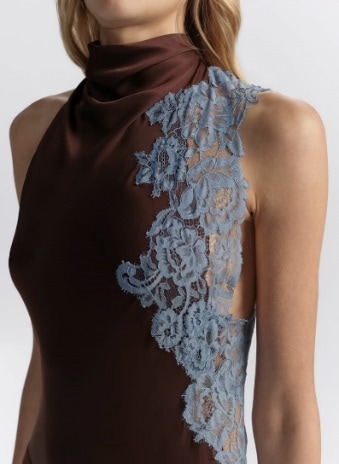
This direction connects naturally with the evolution of luxury office lace.
Guipure + Fluid Satin
Character: architectural versus liquid.
Guipure's raised motifs provide visual weight while satin supplies movement and reflection.
A structured Guipure bodice over a bias-cut satin skirt is a classic example, but the principle can be modernized through unexpected colors: navy Guipure with copper satin, ivory Guipure with citrus yellow, or black Guipure against dusty lilac.
Embroidered Tulle + Minimal Base Fabrics
Character: ornament versus restraint.
A simple crepe column dress can become significantly more valuable through a strategically placed embroidered-tulle panel, sleeve or overlay.
Because the base silhouette remains controlled, the embroidery has space to communicate craftsmanship.
Cotton Lace + Technical or Utilitarian Fabrics
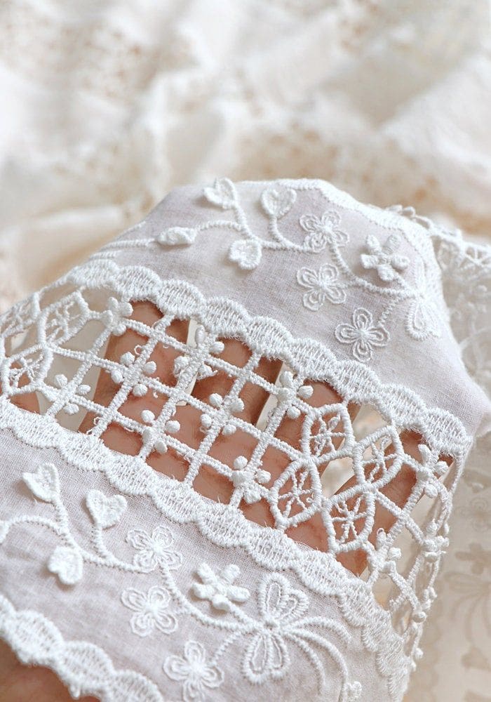
Character: craft versus functionality.
Cotton lace beside poplin, twill or technical nylon creates a contemporary daywear vocabulary that moves lace away from ceremonial associations.
This pairing works particularly well for resort collections, premium casualwear, modern feminine labels and fashion brands seeking a less predictable interpretation of lace.
5. Contrast Must Work in Production, Not Only on a Moodboard
For garment manufacturers and commercial fashion brands, successful contrast styling requires more than creative instinct.
Different fabrics behave differently during cutting, sewing, pressing, washing and wear.
Before approving a mixed-material design, development teams should evaluate:
Weight compatibility. A very heavy Guipure may distort a lightweight base unless construction is reinforced.
Stretch compatibility. Combining stretch and non-stretch fabrics can create seam distortion or unexpected tension.
Shrinkage. Natural cotton bases and synthetic embroidery constructions may respond differently to finishing and laundering.
Colorfastness. Strong contrasting shades should be tested for migration and bleeding.
Motif placement. Large lace repeats may increase consumption when motifs must align across seams.
Seam engineering. Transparent lace requires more deliberate finishing because construction becomes visible.
Repeatability. A striking sample has limited commercial value if its fabric or color cannot be reliably reordered for production.
This is where professional fabric sourcing for designers becomes inseparable from creative direction.
United Lace's B2B approach is built around this intersection of design and commercial reality: helping designers and manufacturers source lace and embroidery fabrics not simply for visual impact, but for garment application, consistency and repeat production.
6. Why Contrast Is Commercially Valuable for Fashion Brands
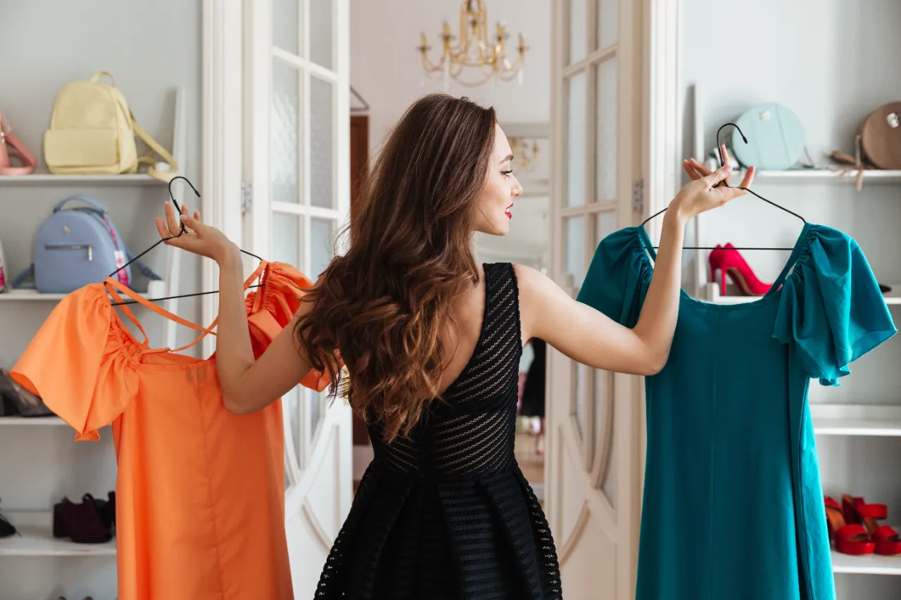
Contrast styling is not only an aesthetic strategy. It can become a product-development strategy.
A distinctive lace can be paired with several base fabrics to create multiple SKUs without sourcing completely different hero textiles.
One Guipure design, for example, might become:
- a monochromatic premium dress;
- a contrast-lined cocktail dress;
- a lace-panel tailored jacket;
- a skirt combined with satin;
- a statement sleeve;
- or a limited-edition color-clash version.
This improves the creative productivity of a textile while helping brands build recognizable visual continuity.
The same logic supports merchandising.
A collection does not need every garment to be loud. Commercial basics can coexist with a smaller number of contrast-driven statement pieces that attract attention in campaign imagery, window displays and social content.
This balance between creativity and restraint is closely related to the philosophy explored in Quiet Luxury Lace: premium perception increasingly comes from precision and material intelligence rather than simply adding more decoration.
7. United Lace: Turning Textile Contrast into Design Possibility
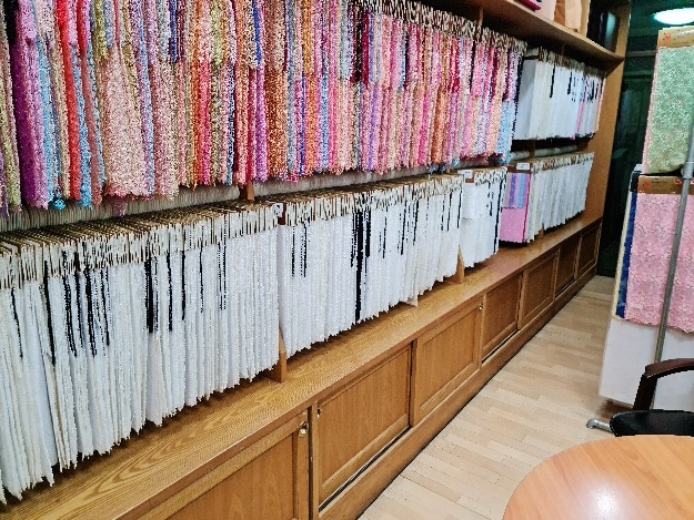
For more than seven decades, United Lace has developed expertise around lace and embroidery fabrics for designers, garment manufacturers, retailers and fashion businesses.
That experience is particularly relevant to contrast styling because successful material combinations require an understanding of more than motif alone.
Designers need to consider hand-feel, transparency, density, drape, dimensionality, garment construction, color interaction and commercial repeatability.
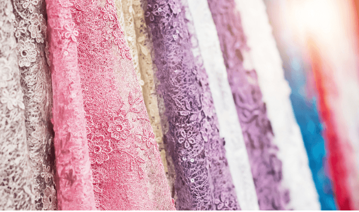
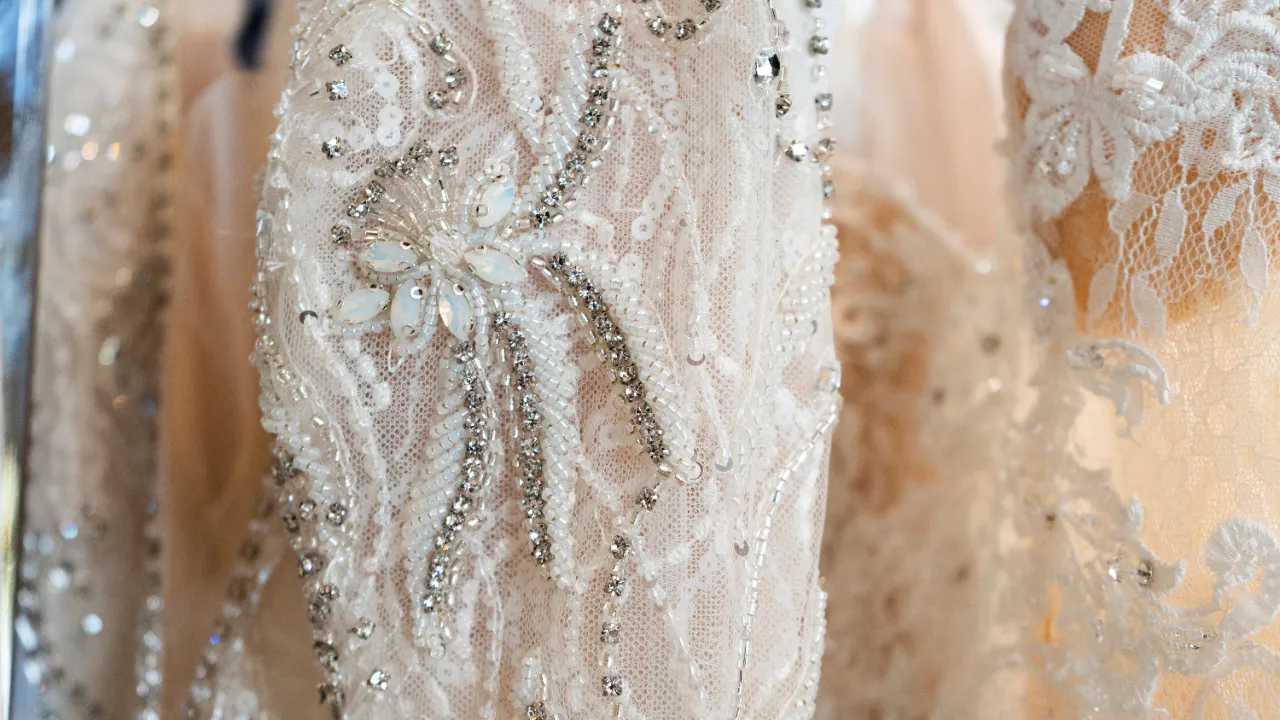
From delicate Chantilly and airy tulle to architectural Guipure, multicolor lace, cotton lace, metallic effects and dimensional embroidery, the United Lace product collection provides different material personalities that can be combined with contemporary fashion fabrics rather than treated as isolated decorative textiles.
For designers looking to see how lace translates from fabric selection into finished clothing, Parry Lace Studio, United Lace's own fashion label, provides another perspective on lace as a wearable contemporary material.
The objective is not simply to put lace onto a garment.
It is to understand what lace can do to the visual language of the garment.
Conclusion: Contemporary Style Lives in the Space Between Opposites
Modern fashion does not always need perfect harmony.
Sometimes the most compelling design begins when two elements should theoretically conflict—but somehow make each other stronger.
Soft Chantilly beside severe tailoring.
Architectural Guipure against liquid satin.
Matte cotton lace beside technical fabric.
Romantic embroidery interrupted by a minimalist silhouette.
Fuchsia against orange.
Teal beneath black lace.
Ivory embroidery floating over cobalt.
The sophistication comes from control.
For designers, the goal of Contrast Styling is therefore not to make fabrics match. It is to understand their personalities well enough to know why they should disagree.
And with Color Clash, the objective is not simply to choose opposing colors. It is to use transparency, motif, surface, light and texture to create a relationship between them.
When handled intelligently, lace and embroidery become ideal mediators between opposites—capable of making strong colors more nuanced, simple silhouettes more dimensional and familiar fabrics feel unexpectedly contemporary.
That is where textile knowledge becomes creative advantage.
To explore premium lace and embroidery fabrics for your next collection, contact United Lace.
We supply fashion brands and garment manufacturers across Thailand and worldwide.
LINE Official: @unitedlace | Instagram: @united.lace | Bangkok Showroom by Appointment.
FAQs
What is contrast styling in fashion?
Contrast styling is the deliberate combination of fabrics, colors, textures or silhouettes with opposing characteristics. Examples include delicate Chantilly lace with structured tailoring, Guipure lace with fluid satin, or transparent embroidered tulle with opaque fabrics. Successful contrast creates visual tension while maintaining a clear design hierarchy.
How do you make clashing colors look sophisticated?
Control proportion and use texture to connect the colors. Rather than presenting two saturated colors as large flat surfaces, introduce one through lace, embroidery, sheer overlays, motifs or accessories. Transparency and surface dimension soften the boundary between contrasting colors.
Which lace is best for contrast styling?
Chantilly lace works well for soft-versus-structured contrasts because of its delicate drape. Guipure creates stronger architectural contrast, while embroidered tulle is particularly effective for layering and color interaction. Cotton lace works well with casual and utilitarian fabrics, while metallic lace creates contrast through light reflection.
Can lace be combined with modern fabrics?
Yes. Contemporary lace can be combined with satin, crepe, tailoring fabrics, cotton poplin, denim, organza and selected technical textiles. The key is to evaluate weight, stretch, transparency, drape and seam compatibility during product development.
How can fashion brands use color clash commercially?
Brands can use controlled color clash for hero products, limited editions, campaign pieces and seasonal capsules while maintaining more commercial colorways for core products. Using the same lace across multiple lining or base colors can also expand SKU possibilities while retaining a recognizable textile identity.
Where can designers source wholesale lace fabric in Thailand?
United Lace is a Bangkok-based specialist in wholesale lace and embroidery fabrics serving fashion designers, garment manufacturers and textile businesses. Its collections include Chantilly, Guipure, French lace, tulle lace, cotton lace, multicolor lace, embellished embroidery and other design-led textile categories for commercial fashion development.

 |  |  |  |  |
#unitedlace #lace #embroidery #cottonlace #drylace #frenchlace #eyelet #chantillylace #lacewholesale #fancylacefabric #lacewholesaleonline #multicolor #tencel #cotton #guipure #wholelacesupplier #lacesupplier #lacecharacteristic #laceproperties #innovation #ecofriendly